

Short Guide on How to Create Glassmorphic Design Effect Using Only HTML and CSS


What is Glassmorphism
Glassmorphism is a new design trend that is currently very popular. You'll see it all over websites such as Dribbble, and even big companies like Apple and Microsoft are using it.
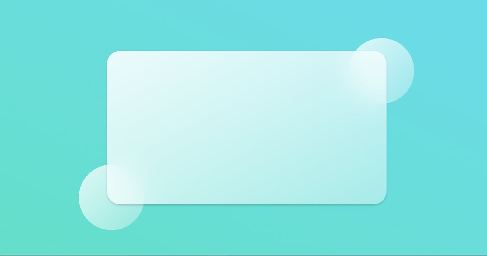
The main aspect of this trend is a semi-transparent background, with a sublime shadow and border. You also have a blur added to the background itself so that whatever is behind the background is beautifully "morphed" into the element itself. Does that make sense?
Here's an example:
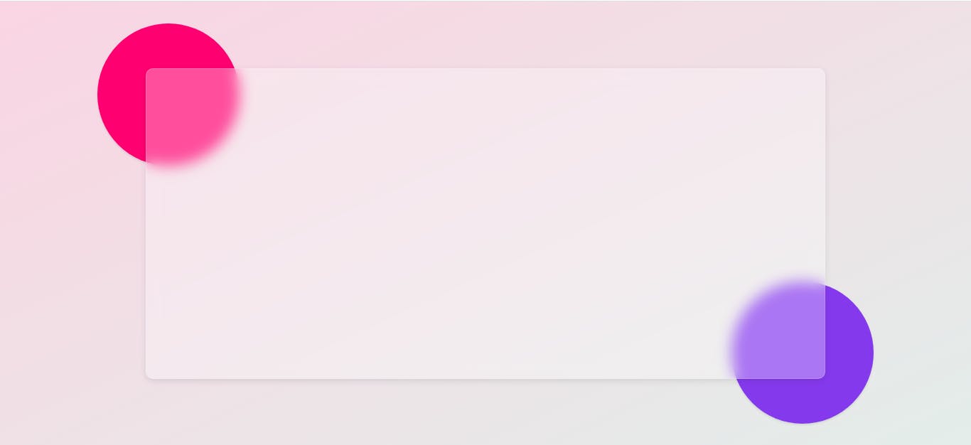
So this is the effect that I want to show you how to create in this tutorial. We'll see how to apply it using only HTML and CSS.
Let's gets started
- First of all create an HTML and CSS file (say index.html and style.css)
- Paste this code into your HTML file:
!DOCTYPE html>
<html lang="en">
<head>
  <meta charset="UTF-8">
  <meta http-equiv="X-UA-Compatible" content="IE=edge">
  <meta name="viewport" content="width=device-width, initial-scale=1.0">
  <title>Glassmorphism effect</title>
</head>
<body>
    <div class="container"></div>
    <div class="circle1"></div>
    <div class="circle2"></div>
</body>
</html>
- Paste this code into your CSS file
*,
*::after,
*::before {
  margin: 0;
  padding: 0;
  box-sizing: border-box;
}

html {
  font-size: 62.5%;
}

a {
  text-decoration: none;
}

ul {
  list-style-type: none;
}

body {
  position: relative;
  font-family: 'Poppins', sans-serif;
  width: 100vw;
  height: 100vh;
  background-color: #ffb703;
  background: linear-gradient(to right bottom, #fad2e1, #e2ece9);
  font-size: 1.6rem;
  display: flex;
  justify-content: center;
  align-items: center;
}

.container {
  position: relative;
  width: 70vw;
  height: 70vh;
  background: rgba(255, 255, 255, 0.3);
  backdrop-filter: blur(10px);
  border-radius: 10px;
  box-shadow: 0 0.3rem 1rem rgba(0, 0, 0, 0.1);
  border: 1px solid rgba(255, 255, 255, 0.18);
  display: flex;
  justify-content: center;
  align-items: center;
}
.circle1,
.circle2 {
  position: absolute;
  width: 20rem;
  height: 20rem;
  z-index: -1;
  box-shadow: 0 2px 3px rgba(0, 0, 0, 0.1);
  background-color: #ff006e;
  border-radius: 50%;
}

@media (max-width: 50rem) {
  .circle1,
  .circle2 {
    width: 12rem;
    height: 12rem;
  }
}

.circle1 {
  top: 5%;
  left: 10%;
}

.circle2 {
  background-color: #8338ec;
  bottom: 5%;
  right: 10%;
}
Pro Tip
You can save a lot of time by checking out glassmorphism.com . It's a website that will helps you to generate glassmorpic CSS styles. Also, you can modify as you wish so that you don't have to do manually.
More projects related to glassmorphism effect by Nikhil
Glassmorphism UI Design
Profile Card UI
Calender Glassmorphism Ui Design
My Thoughts
I'm always love when I get feedback about my blogs, so don't hesitate to play with the comment/discussion area, like and bookmark this blog if you love it or share with others.